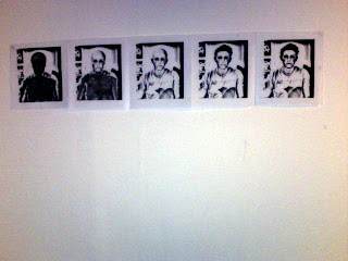
After I felt the White print on black paper didnt work so well I tried it black on white how I originally planned the prints to look. I am very pleased with the outcome of these prints as the look very clear compared to the White on Black Prints. I feel these prints could work well individually as stencils for graffiti prints or well as a train of prints.
Thursday, 10 November 2011
Black negative Screen Prints
After using the Rayograms I liked the way it inverted the image and made the photo look like an X-ray. I wondered if I could replicate this with paint and hand made print. Here are the out comes of my prints.
I'm quite pleased with the prints as they work well as a train but I feel the first train of prints I did was better and less blurry than the second set of prints. I also unhappy as the white doesnt give as much detail on the prints as the test prints in black.
Tester 1 for the Screen Printing
These are the first test prints I did on test news print paper. I was really pleased with the out come of the print as it takes out all the graininess of the Digital prints and look really effect running in a train of prints showing each step of death. Next I want to try printed this in inverted printing with white paint on black card.
Screen Printing
After my failed attempts at Rayograms, I thought trying hand made print was the way forward and when to the print workshop on the Harmer buildings 4th floor. I asked if it was possibly to screen print photos they said it was all I had to do was change the mode in Photoshop my going to;
Image > Mode > Grayscale (as shown in the screen shot below)
Image > Mode > Grayscale (as shown in the screen shot below)
I then had to change the printing mode to screen to make the detail and shadings of the image into dots to make it easier to see the detail. You can see this in the new image below
I did this for all 5 images and printed them in to a run of 5 images
I had to oil the back of the images with vegetable oil to make the paper transparent and this allows the images to printed on the screen when covered in light sensitive paint, and locked into the developing machine. Once the screen is set up I am ready to start printing
Attempts at Rayograms
After achieving my final designs I wanted to experiment with different ways of printing my designs. So I tried to go back to the dark room on the photography floor in Harmer buildings as I thought it would give a photographic element to my work. Also it will make my work inverted and would be good to compaire the digital prints to the photographic prints.
I started by printing off my designs onto printing assotate The images below are the assotate prints. I quite like these once placed against a white background as it takes out all of the graininess of the digital prints.
Next I tried a few of the assotate images on the light sensitive paper in the dark room. For this first image I exposed the rayogram for around 4 seconds.
I feel this was exposed for to long and turned out to to dark as the image is hard to see and doesnt look very effective.
This is another rayogram I produced which I exposed for 2 seconds. Here I like how it looks like an
X-ray but but feel the photo is to gray and light and doesnt achieve the effect I wanted.
Many of my other rayograms didnt turn out or work very well so I didnt continue with this process and decided I would be best looking at other means of printing my designs.
Wednesday, 9 November 2011
Development of images 4 & 5
On image 4 I have included the sketch of the bust of the skeleton on a previous post which I have set to 50% opacity to make it look like the ribs, spin, and arms are waring through the skin. I have also have erased the eyes out of the original photo of myself to make the decaying process continue. On the Skeleton sketch I have added a new filter onto the image which is in the same place as the "Photocopy" filter but instead but changed it to "Water paper" filter.
Filter > sketch > water paper
For the 5th and final image I brought the image of the skeleton bust through to 80% opacity, I choose 80% as its enough to see a strong full image of the skeleton but is not so over powering or to dark when I print it off. Here I have laid the image of the skull over the image of the skeleton bust as its by own drawing and looks more effective.
Development of Final image 3
For my final design for the third image I carried on the decomposing process by removing the hair form the base picture of my self, this reveals more detail on the top of the head and looks more decayed also the cheeks and neck look more decayed as though the skin is being worn away and is revealing the flesh and bone underneath
The effect on the skull is still on "Lighten" and the base photo has the "Photocopy sketch effect" on it
Subscribe to:
Posts (Atom)


